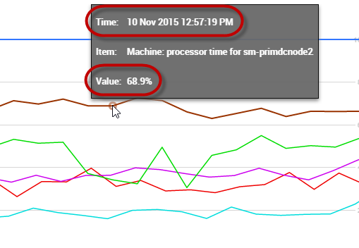
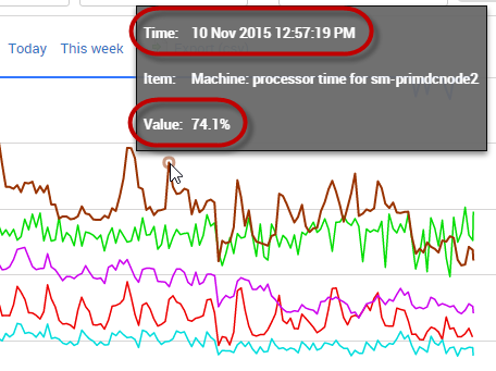
If you look at a specific point on a graph showing 10 minutes of data, then look at the exact same data point on a graph showing 24 hours of data, you may see a different value. For example, the first graph below shows machine processor time as 68.9% at 12:57:19PM, but the second graph displaying a longer time range displays the value as 74.1% for the same data point:
The difference is because some of the values for the longer time period have been aggregated, while others haven't been included. The specific data point you're interested in now contains a summary of other points in close proximity. This form of data sampling makes sure that whatever the time range displayed, peaks and troughs are maintained on the graph relative to each other, so you don't miss anything important.
If you're interested in seeing the most accurate values for a specific data point, use data points from a shorter time range.
Was this article helpful?
Articles in this section
- Error: WINRM 0x8009030e
- Redgate Monitor migration guide to version 14
- "Your browser does not seem to be accepting cookies." error message
- Setting up OpenID Connect (OIDC) with Entra ID in Redgate Monitor
- Proxy Configuration in Redgate Monitor
- WMI error after DCOM hardening patch
- Redgate Monitor alert tuning
- Redgate Monitor set up for optimal performance
- Redgate Monitor Base Monitor Service Account
- Configuring Metrics and Alerts in Redgate Monitor

