Comments
10 comments
-
 Hi Brian,
Thanks for your feedback.
We did initially have the four grouping bars each in their own colour - much as your edited screenshot shows. But after early usability testing, we found that more people were put off by the excess of colour, rather than seeing it as a way to help them quickly drill down to the section they're interested in. In the end, we settled on a more subtle approach using icons, which in testing, seemed to work equally as well.
We'll have a ponder over the other suggestions...
:-)
Dom -
What's "usability testing" Those users don't know what's good for them!
") hahah just kidding.
hahah just kidding.
Were your initial colors somewhat bold or were they more subdued? The colors that I chose were extreme for sure.
Well if I lose out to the majority, at least let me plea for an application option to "colorize group bars" - with the default set to "off" of course.
While I'm at it, let me also ask for some additional font options for viewing the object text. Lucida Console is OK, but I'm more of a Courier New kind of guy. How about an application option for object text font:
-Lucida Console
-Courier New
-Courier
By the way, I love the font size options right there in the bottom panel.
Regarding the scrollbar inside the group - if you have a large number of items in a group, when you scroll down, you lose the group context in which you are in. If you have all groups expanded, when you scroll up and down globally, you may whiz by a group header and then you don't know which group you are in (because all group headers are gray). With the scrollbar contained within the group, the group header is always visible (kind of like freeze panes in Excel) and you always maintain context.
-
I know that our original colours were as subdued as we could make them whilst still being distinct enough to tell apart. Half the trouble though, was that this meant that we had some parts of the UI themed and others not, which made for some potentially eye watering combinations.
If I can catch a developer off guard, and ply them with the odd beverage, I'll see if they'll consent to your colourisation plea. But be warned, they can be a steely bunch and it may take many months of beverage persuasion for them to yield.
With regards to the scrollbars in the group, context is also maintained by looking at the central column and the object name columns either side. So taken in isolation, each line tells you whether it's equal, in both but different, or only in one of the databases without the need to see the grouping bar it belongs under.
Another slight disadvantage is that if each of the bars remain on screen, then we take away valuable screen space for displaying the objects themselves. In this instance, having a global scrollbar actually saves us a bit of space.
Glad you like the font resizing, I'll see if a font change option is something that we can squeeze into a future release.
:-)
Dom -
Thanks for your quick response to my feedback.
Let me make one more request. I really miss the color coding of the differing lines when viewing each object's text. I am speaking of SqlCompare v3 because I never used v4.
The subdued colored arrows indicating the lines that have changed or that differ just don't catch my eye, and I have to scan for them.
<soapbox>
One could certainly argue that color coding can easily be done poorly, and that even when done correctly it detracts from the beauty of the screen. To me the beauty is the ability for me to find what I need quickly (finding changes by line) and get done what I need to get done and then get on with my other tasks.
</soapbox>
Version 3 (You can find the lines that differ immediately)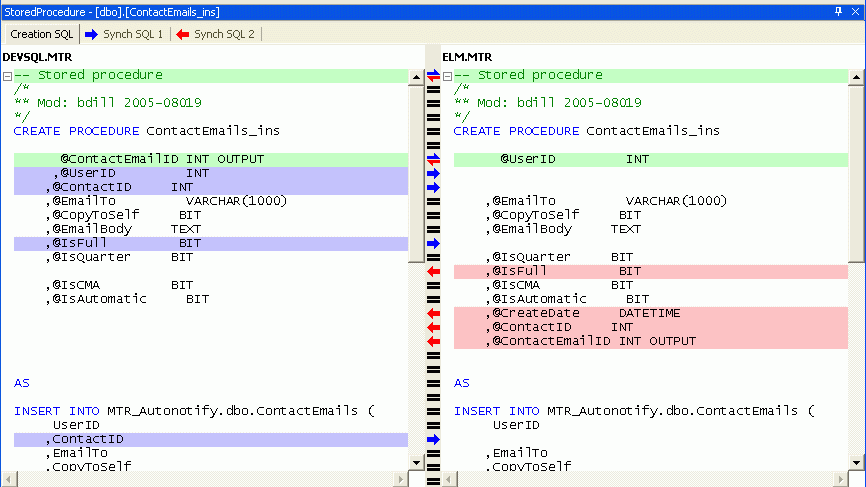
Version 5 (I almost miss the lines that differ)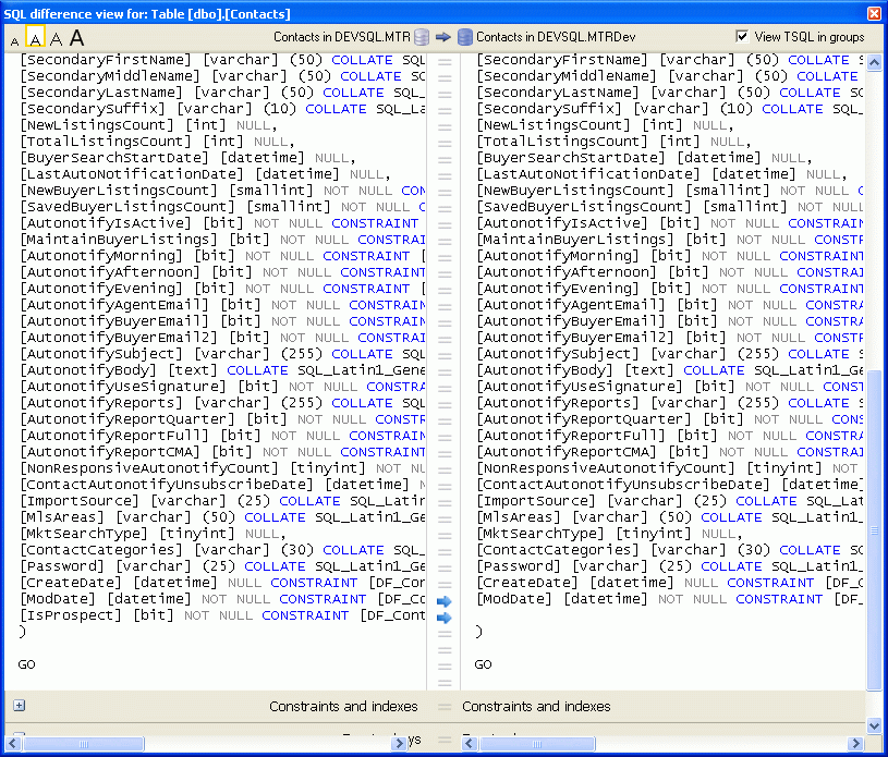
-
This is a point that I missed in the alpha and still miss in the beta. The actual highlighting of the different sections of differing lines is great, but highlighting the entire added or deleted lines would help them stand out.
I particularly second the comment about spotting differences quickly.
Cheers
B. -
+1 to one of bdill's points- I would like a font selection for the "SQL Difference View" (personally I'm a Proggy Clean guy). Or is this a big ask (given that other parts of the compare UI fit around the font/font size)?bdill wrote:While I'm at it, let me also ask for some additional font options for viewing the object text. Lucida Console is OK, but I'm more of a Courier New kind of guy. How about an application option for object text font:
-Lucida Console
-Courier New
-Courier -
I especially agree with the "highlighting the different text" comments.
it's great to now see exactly which part of an individual line are different, but as has been pointed out, without highlighting the entire line as well, you may actually miss the fact there is a difference at all
A suggestion could be that for any line that is different, highlight the ENTIRE line in a very light shade of the highlight colour, and then highlight the individual words/characters that are different as per the new V5 way (in the normal darker highlight shade) -
Thanks all for the comments.
We went through a few iterations of this, and by all accounts, it's still not as good as we would like.
What we were aiming for is that the central column is the clearest indicator that a difference exists. If you scan your eyes down the middle, anything that's equal is pretty much subdued, so when a difference does crop up, it should be more noticeable than the previous version. In the old version, looking down the central column could be a bit bewildering and you could often miss a difference becasue the strong black of an equals sign was very dominant. Essentially, you have less screen to look at to spot the differences.
There are times when the coloured lines on either side actually detract from being able to spot differences. If you get a messy mix of lines that differ, it can all break down, looking more confusing than adding order.
However, with all that said, it sounds like it still needs some work, so I'll see what I can do.
With regards font swapping, I can't promise anything, but I'll certainly put it on the list of things to shove in front of a developer when they least suspect it.
Dom -
I'm not sure there is a way to add multiple pairs of the same comparison from the front end (Maybe with a Save As... project menu?). It does seem possible to do that by copying and editing the xml file from the project store folder...
I'm looking for baseline times for image comparisons. I have some large tables with thousands of images. I'd like to see how long it takes to compare 10,000 or 100,000 records with images in your test environment, and have the details of environment used so I can calculate how long the comparison should take.
What does the
< > Don't wait on this screen
checkbox do?
-Robert Sterbal -
Hi Robert,
The "Don't wait on this screen" checkbox has since been renamed, it now says "Close message box on completion"
The idea behind it is that it gives the user an opportunity to not have the progress dialog disappear when it's finished.
In user testing we found that people were sometimes unsure what had just occured when they initially ran a comparison. Some thought it had actually performed a synchronization, instead of just the comparison, so the first time it runs, we wanted the user to be in no doubt that only a comparison had occured. Over time, this reassurance isn't necessary, so it's nice to be able to turn it off, and have the message box disappear as soon as it has completed.
Hope that explains it !
Dom
Add comment
Please sign in to leave a comment.
I have referenced before and after screenshots at the end of my post so you can literally "see what I mean"
1) Put the scrollbar within in each "section" rather than globally. By "section" I mean 1) Objects that exist in both but are different, 2) objects on in X, 3) Objects only in Y, 4) Identical objects.
The desired effect is to always see all 4 sections on screen so that you know they exist.
2) Color code each section to make it easy to quickly visually identify that section without having to think about it. Of course you will have to think about it at first, but after a while your brain will subconsciously associate the color with the section that it represents. I chose some bold colors for my quick PhotoShop hack job, but the point is that there is alot of gray here (sorry - "grey" for you Brits
3) Number each list item within each section. I nice little touch that shouldn't be too difficult to implement.
Before
After